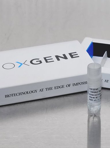
Oxgene
A world-leader in gene and cell therapies, and a top 50 fastest growing company, working at the very edge of what's impossible.

Strategic Challenge:
Create a brand proposition that put them light years ahead of everyone else.
Creative Challenge:
We wanted to make this business appear beautifully engineered.


This new brand is an exciting representation of all that I have constantly strived to build - a dynamic and innovative organisation that drives progress and encourages constant improvement"


What emotions and personality did we want to create for the brand?
This project was all about pushing the limits of what's possible with style, beauty, and elegance.
To give this brand it's feeling of both perfect engineering and cutting edge technology, we chose a combination of the 'Engineer' and 'Futurist' archetypes. But these in themselves would not be enough, we needed a knock out idea.
To help us modernise the brand, a name change from Oxford Genetics to OXGENE helped to simplyfy this and allowed us to give the logo it's modern highly engineered feel.
Our biggest strategic challenge was building a brand that was as advanced as OXGENE were. As a world-leader in gene and cell therapies, and one of the Deloitte Fast 50 companies, they are truly pushing the boundaries of what was possible in the industry. We had to match their aspirations in creating a cutting edge brand, but many others in the scientific community claim to be operatng here too.
So, to make this brand believable, all aspects had to be perfect - from the big idea, the narrative, right through to the personality expressed through an uber modern visual style.
A lot of time was spent defining the 'feeling' to ensure that the design concepts stayed on track. To do this we created many mood boards including some as videos, and we used the character 'Silver Surfer' as a metaphor for the brand's personality.
We wanted the brand to feel both beautifully engineered, with a sense of floating in space, while supporting the line 'Biotechnology at the edge of impossible'. With the help of our unique brand archetypal model RADNB, we quickly identified the right visual styles that helped us pull the concepts together.
The line 'Edge of impossible' enabled us to talk about the many different areas the business covered. It also gave us great creative flexibility in marketing campaigns.
The project deliverables included a new identity, narrative, visual language and brand guidelines, a website and templates for PowerPoint presentations, business cards, stationery, exhibition stands and other corporate materials.


.jpg?width=50)

I've worked with Rich on a couple of absolutely brilliant rebrands of tech companies in different sectors. The sector never matters, Rich gets to the heart of what the organisation is all about, and helps translate that into a meaningful brand."

